Hello!
Today I have something a bit different to share with you.
I LOVE to explore all kind of paper craft, and although I thoroughly enjoy making lots of cards to brighten someone’s day, I also like to branch out and try new things!
To me, mini albums have always been adorable, complicated, time eaters that I look at on Instagram (often going down a rabbit hole or two, emerging more overwhelmed and certain I couldn’t make one if I tried – they all look so good and I don’t even know where to start!).
But then, I saw one on the Doodlebug Design blog, cupcake shaped and GORGEOUS. And it had step by step instructions (I’ll link it here for you to see, please check it out, it’s amazing!).
Now, I have the same cupcake svg, and although I was super tempted to create something very similar, I instead decided to be brave (still following instructions of course) and do something a little different! Plus I don’t have those adorable new papers yet – they are now on my wishlist!
Halloween. It’s not for a while but all the creepy and spooky characters by Doodlebug bring me so much joy! Plus with two small children I know that once Halloween comes around, I’ll likely print the photos I want to add to the album and have too many Christmas projects. to get started on and this would be put on hold – why wait?!
I’ve got more Halloween themed SVGs than I care to admit so it was just a matter of picking which one I’d like to try first.
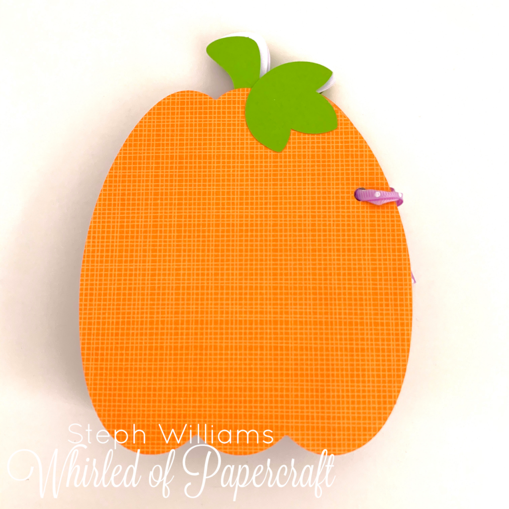
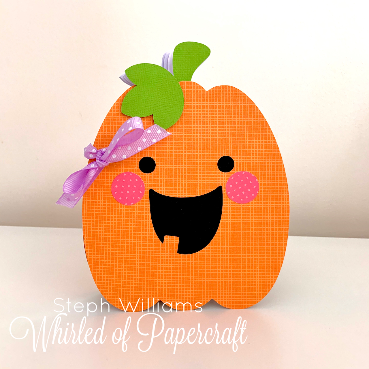
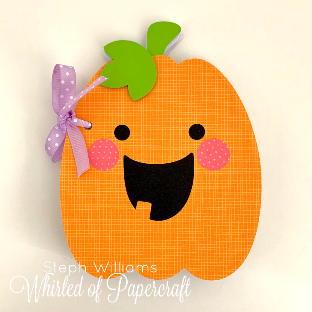
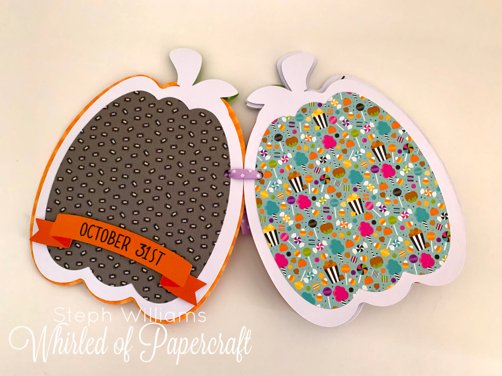
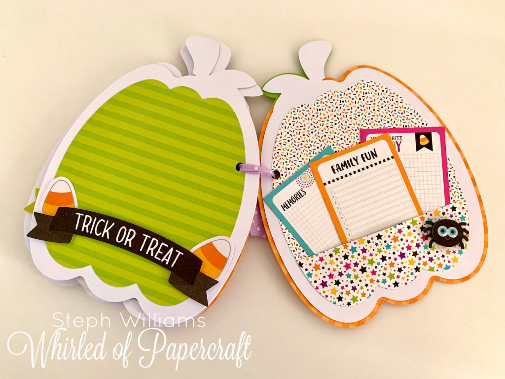
This goofy pumpkin was my pic!
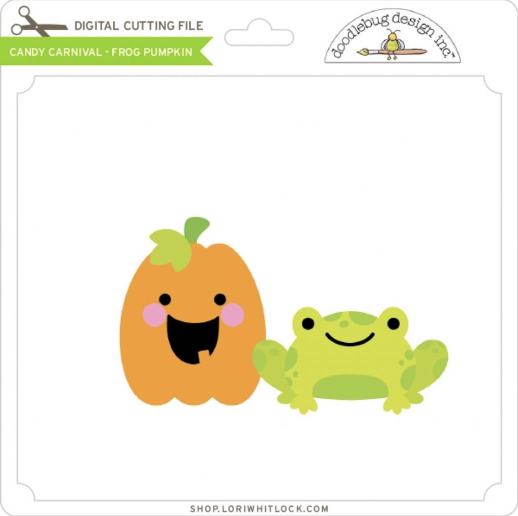
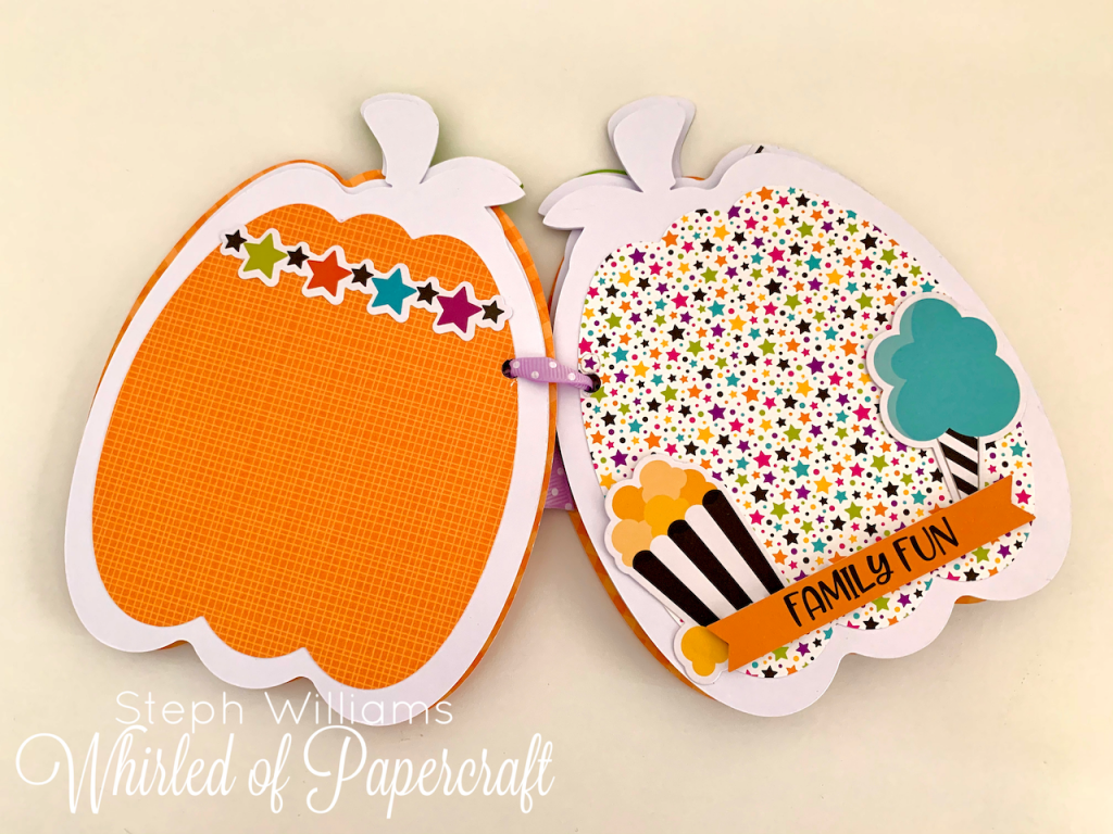
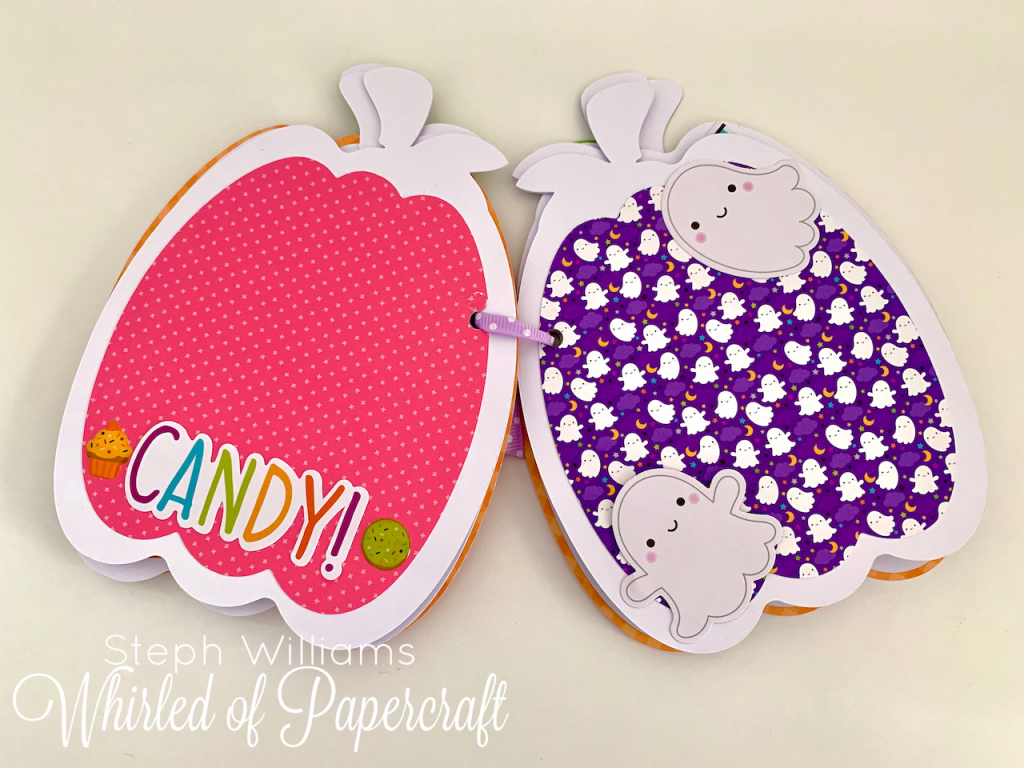
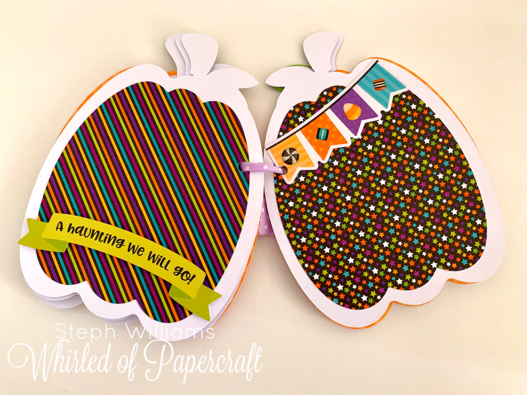
It was then simply a matter of deciding how many pages I wanted to make and onto the harder decision of which Doodlebug papers I wanted to feature in this project. I picked papers from both the “Candy Carnival” and “Pumpkin Party” collections.
Here is what my Cricut Design Space looked like as I planned. As you can see, lots of white pumpkins were used. This was because I was using a thick paper and gluing three together for each page made them as stiff and sturdy – for all the page turning they will endure in the future!
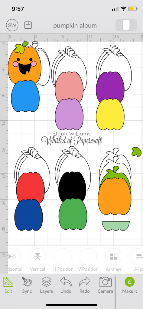
The smaller pumpkin shaped pieces of varying colours were created by selecting the original orange layer, and using “Hide Contour” in actions to remove the lines of the face, then resizing it slightly smaller to give me that white border around the edges.
I kept one of the pieces, face removed but the original size, for the back piece of this album to make it look complete.
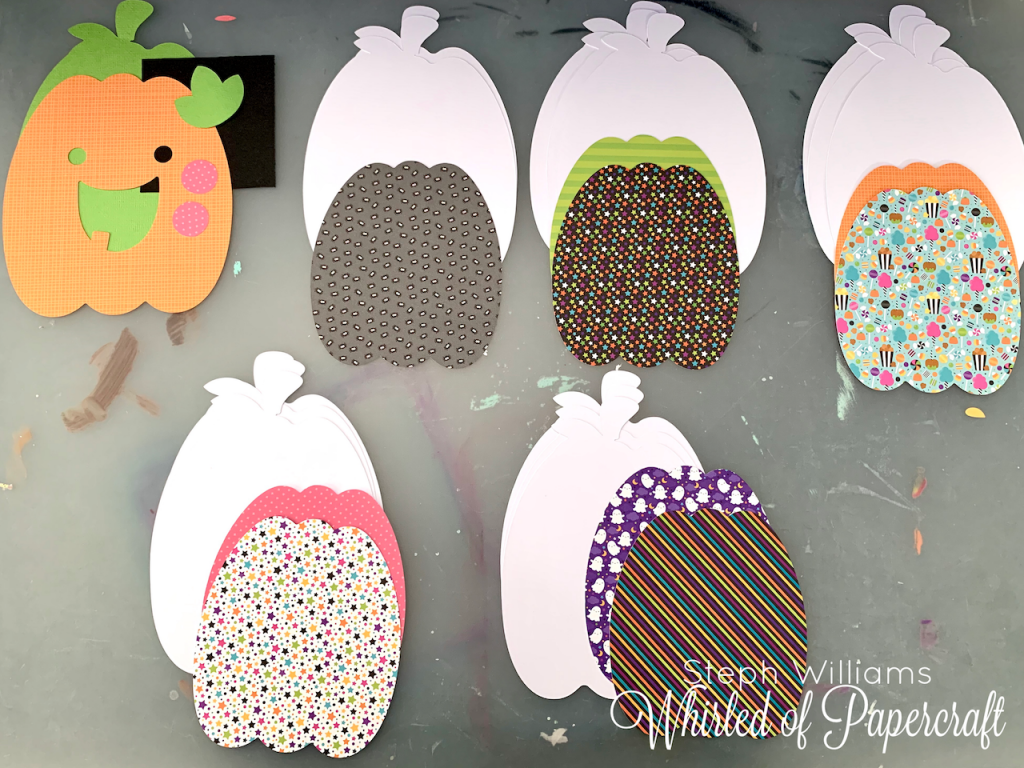
Once each of the “pages” (three pieces of thick, white paper) were glued together, it was just a matter of picking the patterned paper for each page, and onto the fun part – picking stickers and ephemera to decorate!
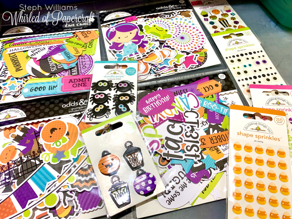
For most of the signs/characters/candies they are only glued at the very edges on the parts closest to the sides of each page. When it comes time to adding photos later, I will be able to slide the photos under them, creating a more seamless/planned look.
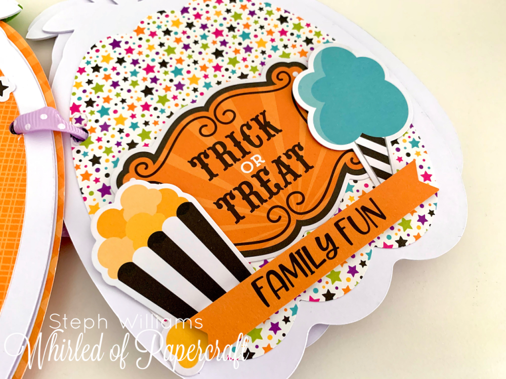
I must admit, this was far easier than I thought it would be.
I know, mine isn’t as heavily decorated as others that I have seen. And it’s not finished yet – I now need to wait until after Halloween to fill it with photos of my children. But I think for a first attempt it has turned out pretty cute and I honestly understand the appeal – this was FUN!
I’m sure there will be MANY more of these mini albums to come!
Thank you for stopping by and checking out my latest work!
What did you think of it? Do you love mini albums too? Or have they seemed too fiddly and complicated?
I promised you’ll love it if you try it!
